Resource Mix Graph details region’s energy sources
This is the latest installment in a series highlighting data visualizations created by ISO New England to help explain different aspects of the region’s bulk electric system.
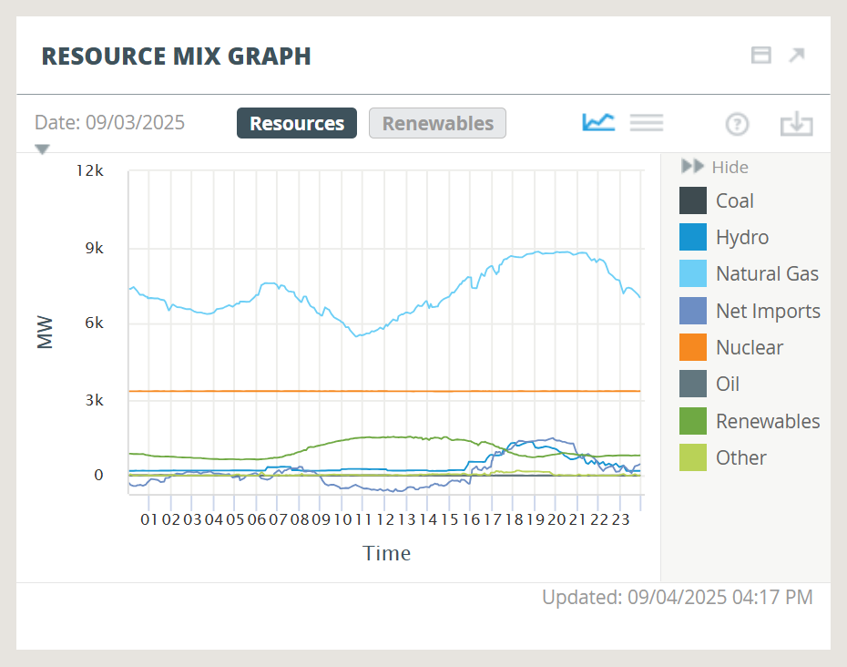
Several kinds of resources provide the electricity New Englanders use. The Resource Mix Graph, part of the ISO Express data dashboard, shows how output from each resource type changes throughout the day.
Each resource type is represented by a different color line. The lines rise and fall in response to shifts in demand for electricity, fuel prices, and other factors. (The Resource Mix Graph is related to the Resource Mix Chart. While the graph tracks the resource mix as it changes throughout the day, the chart presents a snapshot of the resource mix in real time.)
The light blue line, representing natural gas, usually tops the graph because the region gets most of its electricity from natural-gas-fired generators, amounting to 51% in 2024. Nuclear power, which supplied 23% of the electricity used by New Englanders in 2024, is represented by the orange line. This line typically stays flat throughout the day at about 3,300 megawatts. Unlike other resource types, nuclear plants tend to have a constant output level.
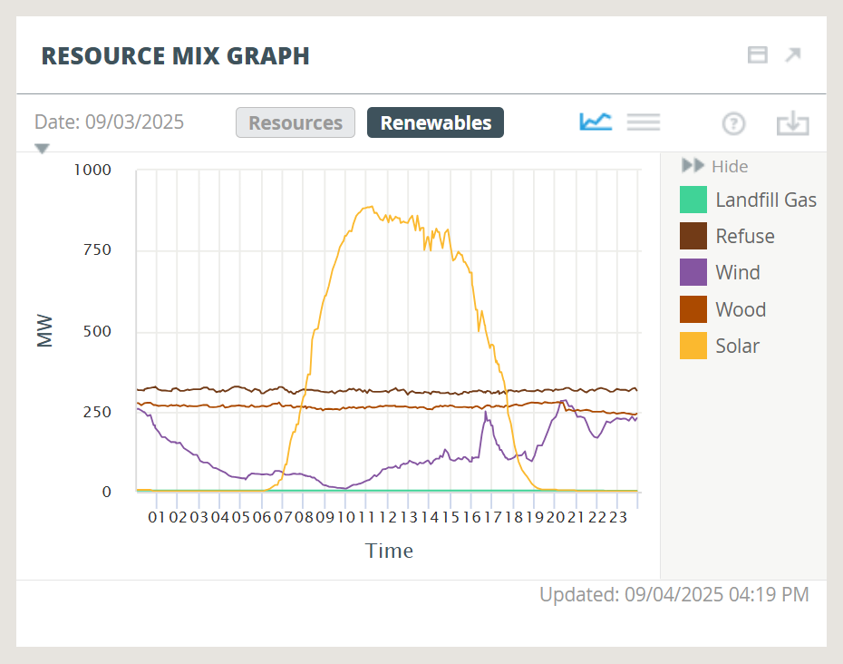
Renewables, shown in dark green, include utility-scale solar and wind resources as well as refuse, wood, landfill gas, and methane. Users may click the “Renewables” button at the top of the graph to view a separate breakdown of output from each type of renewable resource.
Back on the “Resources” portion of the graph, the lavender line represents net imports, which is electricity generated in New York and Canada but consumed here. On an annual basis, New England is a net importer of electricity, relying on imports for 9% of its consumption in 2024. But at times — particularly at midday when demand is low and output from solar resources is high — the region becomes a net exporter. At these times, the lavender line dips below zero, with negative values representing net exports rather than net imports.
The graph also displays lines for hydropower including pumped storage (dark blue), oil (light gray), coal (dark gray), and the “other” category (light green), which includes battery energy storage systems and demand response.
As with all modules within ISO Express, users may click the down arrow icon to download underlying data for the specified date. Resource Mix Graph data is a bit different from most other modules in that it is not updated at regular intervals. Instead, the values change each time ISO-NE system operators adjust the way the region’s fleet of energy resources is dispatched.
- Categories
- Inside ISO New England
- Tags
- resource mix, website