System Load Graph tracks ebb and flow of daily electricity use
This is the latest installment in a series highlighting data visualizations created by ISO New England to help explain different aspects of the region’s bulk electric system.
Demand for electricity ebbs and flows throughout the day. One of ISO New England’s three critical roles is operating the power grid in a way that ensures the appropriate amount of energy is available when consumers need it.
To do that, the ISO’s system operators prepare a daily load forecast based on historical patterns of energy use, weather predictions, and other factors. The forecast may be adjusted throughout the day as conditions evolve.
One place the forecast appears is in the System Load Graph on ISO Express. (It is also reflected in the Demand Chart on our mobile app, ISO to Go. A simplified version, titled System Demand, appears on the iso-ne.com homepage.)
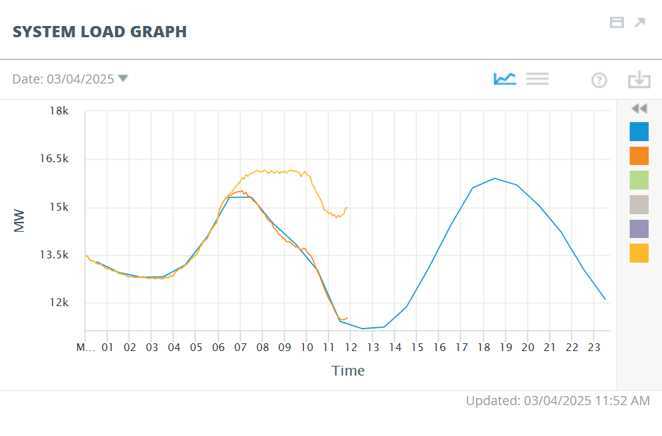
The graph’s curving blue line represents expected demand for electricity at hourly intervals over the course of the day. The orange line represents actual demand as observed by the ISO New England control room. It updates automatically every five minutes. The ISO’s daily load forecasts are highly accurate, so the blue and orange lines usually don’t look very different from one another.
Each day’s demand curve reflects patterns of electricity use rooted in daily routines. The curve rises and crests in the morning as people wake up and begin their days. It rises again in the evening, reaching the day’s peak as people return home from work. Electricity use increases at these times as people turn on lights and use household appliances.
Historically the demand curve has dropped to its lowest point during the overnight hours, when most New Englanders are asleep. But that’s changing as the region adopts more and more “behind-the-meter” (BTM) solar power. These solar installations supply energy at a local level, reducing consumer demand for electricity from the regional power grid.
The yellow line on the System Load Graph shows an estimate of what demand for grid electricity would be without reductions from BTM solar.
Sometimes BTM solar reduces midday demand below the level of overnight demand. This is called a duck curve because the demand curve somewhat resembles the profile of a waterfowl. On cloudy days, the demand curve typically shows little change from morning to afternoon.
The System Load Graph is interactive. Users may select additional features to show demand that cleared the Day-Ahead Energy Market (green), the prior day’s demand curve (gray), and actual demand including demand from energy storage facilities (purple).
- Categories
- Inside ISO New England
- Tags
- system demand