Monthly ISO-NE report follows trends in energy resource output
This is the latest installment in a series highlighting data visualizations created by ISO New England to help explain different aspects of the region’s bulk electric system.
Multiple types of resources provide the electricity New Englanders rely on. Output from each resource type varies over time in response to weather, economics, and other factors.
These variations are tracked in ISO New England’s System and Market Operations Report, a detailed overview of information about the regional power grid. The report is presented to members of the New England Power Pool at monthly Participants Committee meetings, and each month’s slide deck is posted publicly on the ISO-NE website.
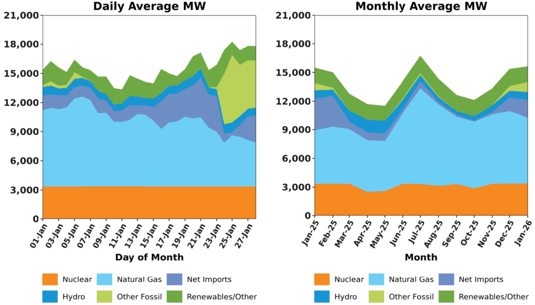
The report’s “Resource Mix” slide includes two stacked area charts displaying each resource type’s average output, in megawatts (MW), on a daily and monthly basis. Each resource type is represented by a different color. The chart includes output from many smaller resources not visible to system operators during real-time operations, resulting in output levels that may be higher than telemetered information seen elsewhere on ISO’s website.
Output from New England’s nuclear power plants rarely changes. These resources, shown in orange, make up a solid horizontal strip at the bottom of the Daily Average MW chart. The Monthly Average MW chart shows more variation, reflecting nuclear plants reducing output during maintenance and refueling. This typically happens during the spring and fall, when overall electricity demand tends to be lower than in summer and winter.
Hydropower resources, shown in dark blue, also provide relatively constant output, reflecting water management practices combined with fairly predictable annual precipitation patterns and river flows.
Natural gas is the region’s predominant energy fuel, providing 51% of the electricity New Englanders consumed in 2025. Consequently, this resource type, shown in light blue, takes up the most space in both charts. The level of output from natural gas, however, is in constant flux.
The monthly chart shows average natural gas output at its highest in the summer and significantly lower during winter. Heating customers use more gas in winter, meaning less of this fuel is available for electricity generation. Tightened supply to natural gas generation typically results in elevated natural gas prices that make resources using other fuel sources more economical. During such times, resources including net imports (lavender) and other fossil fuels (light green) increase production to fill the gap, as the chart demonstrates.
This is also demonstrated in the daily chart. The end of January saw extremely cold temperatures, which increased heating demand for natural gas and increased gas prices. Electricity generation from natural gas declined significantly during this period, while generation from other fossil fuels — specifically oil — increased as they became more economical than the gas resources. Oil resources tend to operate infrequently, coming on line mostly during times of heightened demand in winter and summer.
Dark green represents renewable resources. This broad category, which is based on state laws and regulations, includes wind, solar, and various combustible fuels. For the purposes of the System and Market Operations Report, it also includes battery storage and demand response. Output from these resources is broken down elsewhere in the report, and will be discussed in a future installment of this series.
- Categories
- Inside ISO New England
- Tags
- resource mix