ISO New England launches redesigned website with a new look and increased functionality
Two years in the making, a brand new, completely overhauled iso-ne.com is now live and ready to show off its fresh new design. ISO New England “flipped the switch” to unveil its new site on Saturday, August 23. The website has gone through some BIG changes—visual, architectural, and functional—to make it more user-friendly and improve the way ISO New England delivers information.
If you just can’t wait to see the website and all its new functionality, navigate to the Welcome page now—it will introduce you to the key changes and top features of the new site.
For others who want to learn a little more before viewing, here’s what you can look forward to on your next visit to www.iso-ne.com:
 A New Look and Feel
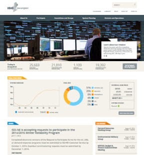
The difference is clear right away: updated colors, fonts, and graphics, and a more streamlined, clean layout make for easy viewing. The home page serves up prominent grid information—such as available capacity, daily peak forecast, system demand graph, real-time fuel mix, and the wholesale hub power price—so that visitors can quickly scan the status of both the region’s power grid and wholesale markets. The latest ISO and industry news items and a calendar displaying upcoming ISO meetings and events are also just a glance away, at the bottom of the home page.
In a word: “Findable”
Improving the “findability factor” of information and data was one of the ISO’s key objectives of this overhaul.
Refreshing and reorganizing content
The old web site was comprised of more than 5,000 pages, but the new site has whittled that down to about 500—without losing or compromising any information. This streamlining was accomplished primarily through content reorganization and the introduction of a new method to sort and find documents and other key information.
An intuitive, drop-down navigation, available on every page, groups all site content into five overarching categories: About Us, Participate, Committees and Groups, System Planning, and Markets and Operations. The navigation also includes subcategories that provide direct links to nearly every page on the website, which means the information you’re looking for is almost always just one click away. Plus, every single web page has been updated or rewritten to include easy-to-understand descriptions of the various markets, operations, and system planning content housed on the site.

Rethinking content delivery: filter, sort, find
When you dig a little deeper into the site, you’ll come across filterable lists for documents at the bottom of many web pages. If you’ve ever purchased a book, clothing, or other goods online, then you’re probably familiar with using filters to narrow down your search results. As part of the iso-ne.com redesign, nearly 50,000 documents were “tagged” and transferred from the old to the new site. Each tag helps define the document by keyword or other attributes that will enable users to “shop our docs” by selecting filterable categories to refine search results.
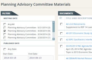 Filterable document categories include: Key Issue, Committee, Meeting Date, Published Date, Document Type, and File Type. Note that the document list on each page is pre-sorted to show only documents that are relevant to that content. For example, on the Participants Committee page, the document list shows only those that have been tagged with “Participants Committee.” A document library, which is the central repository of all documents on the site, is also available.
Data and reports at your fingertips
The ISO’s website hosts data and reports that are frequently accessed by market participants and others to track energy demand, wholesale prices, and much more. However, because these reports were scattered throughout the old site, finding them could be difficult. Enter the new website, where all data and reports on load, operations, billing and settlements, auctions and retired reports are within reach from one spot: ISO Express.
New features help users “make it personal”
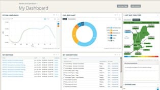 An ISO Express account will help make your visits to the website even more productive by taking advantage of new personalization tools. If you have a registered ISO Express account, you’re already on your way! If you don’t have an account, signing up is simple, free, and quick: Sign up!
Keep on Track
Once logged in, you can customize your ISO Express Dashboard to show the information that best suits your needs and preferences. Create a “My Meetings” panel to keep track of all your upcoming ISO meetings or events you’re interested in, so you can quickly retrieve materials or confirm times, locations, and other details. You can also set up a “My Bookmarks” panel to store all your frequently-accessed links in a handy place (bookmarks can link to any site you frequent, not just the ISO’s).
 Info to your inbox
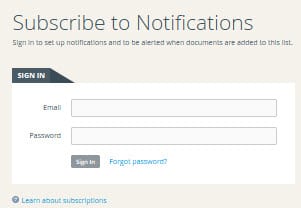
Subscriptions are a new way for you to get the materials you’re interested in. By clicking the “subscribe” link located on a web page or event listing, you’ll receive automatic email notifications when the ISO publishes documents related to that page or event.
For example, if you’d like to receive notification when ISO New England submits filings to the Federal Energy Regulatory Commission simply navigate to the “ISO Filings to FERC” page and click the “Subscribe” link above the document list. From there, you’ll be able to choose whether you’d like to receive a real-time notification, a daily digest (an email with links to all of your subscription choices sent at 4 p.m. daily), or a weekly digest. You must be signed in to use the subscription feature.
Making the transition
 Optimal viewing
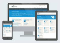
Recognizing the leaps in technology that have taken place since 2005—like bigger computer screen resolutions, new Internet browser types, and smart devices—the ISO built the site using the latest web standards and design best practices so it’s easy to access from a variety of browser types, screen sizes, and mobile devices.
When visiting the ISO’s website on a desktop or laptop computer, the ISO makes these recommendations for best viewing:
- Check that your computer screen resolution is set to 1280 x 1024 pixels or higher.
- Use the Firefox 3.1 browser or higher or Internet Explorer 9 browser or higher.
- If you’re using a PC, check that “ClearType” text is turned on, which will enable you to see the website fonts and layout as intended. In your PC’s control panel, select the “Display” option, choose “Adjust ClearType text,” and then check the box entitled “Turn on ClearType.”
Updating old bookmarks
If you have previously created bookmarks linking to specific ISO New England web pages, many of those saved links will still work. When possible, the ISO built in temporary redirect links that will bring you to the new web page. Because some pages were removed through the redesign process, the redirect link may not take you to the exact place you originally bookmarked, but it will point you to a page with similar or associated content. If you’d like to continue using the bookmarks to ISO web pages stored in your browser, you’ll want to update the link with the new web URL—the redirect links are in place temporarily. However, all of the documents and materials on the site will keep the same URLs; therefore, any bookmarks you have saved to those items don’t need to be updated.
 Explore!
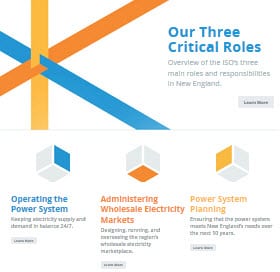
Whether you’re a first-time visitor or a seasoned market participant, we’re pleased to invite you to explore the new iso-ne.com! If you have questions as you’re surfing the site, check out the extensive Help page. And be sure to take a look at the “What We Do” pages to learn more about ISO New England’s role in the industry and our work to keep the lights on in New England.
- Categories
- Inside ISO New England
- Tags
- website
